Find the TV
that's right for you
The Challenge
Samsung UK was looking to update their television section of their website. The goal was to make it responsive and bring it closer to the brand experience of the north american model or better yet become a master template for all regions. Some of the concerning issues where that customers have a hard time understanding what the differences are between television types. Also, they needed a better comparison engine. Finally, they were looking for a solution to promote an up coming feature which would allow customers to find a television best suited for them based on a range of wants and needs.
The solve
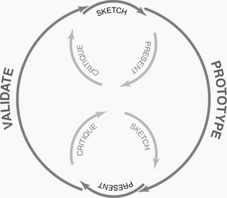
The project begin with a competitive analysis to review how others are tackling some of the concerning issues. For this we reviewed direct competitors, retail websites, electronic focused brands, and both north american and european websites. We also conducted research outside of the television arena but which might have interaction models that could work for our needs.
The north american model was also evaluated to determine what was worth reproducing and what might be done better.
I began sketching out the wireframes following practices common to commence models. Part of the exploration was to see how we might take advantage of a “sticky header”. Typically this pattern allows the top navigation to remain in view as a user scrolls down the page. What if we could add to that? Since we knew that the new TV PICKER feature would be of great value to customers we experimented with also making that call to action “sticky”.
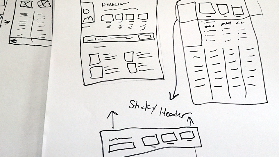
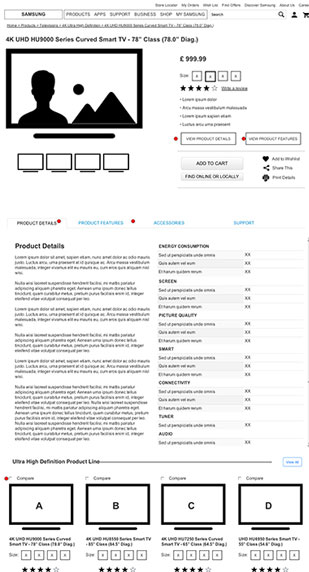
Wireframes were built out as rapid responsive prototypes for each page type (landing page, promotional page, product category page, feature page, product details page, all products page, comparison page, search results page, …etc.).
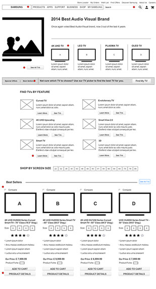
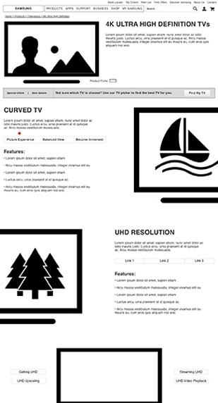

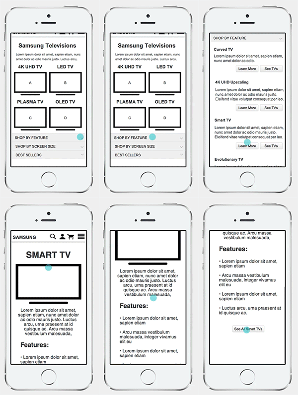
The prototype began with a mobile first approach. I created the prototype to be used not just seen by the internal team and the stakeholders. The goal was to have sign off on the mobile and tablet versions of the wireframes prior to even getting into desktop mode.
By taking the mobile first approach we were able to catch a lot of scenarios that would have proved troublesome later on in the process. For instance how the compare modal would function, how the “sticky” headers would perform, how the navigation would display, ..etc. This appraoch aloud for us to determine such solutions early on in the process and provide UI patterns that would be build to expand to desktop.
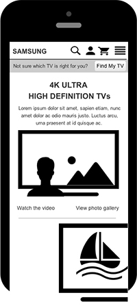
Higher fidelity prototypes aloud the stakeholders to better grasp what the finished product might look like.
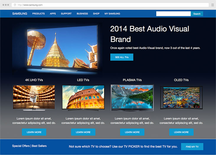
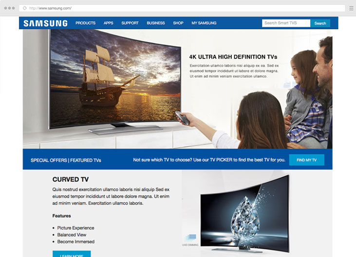
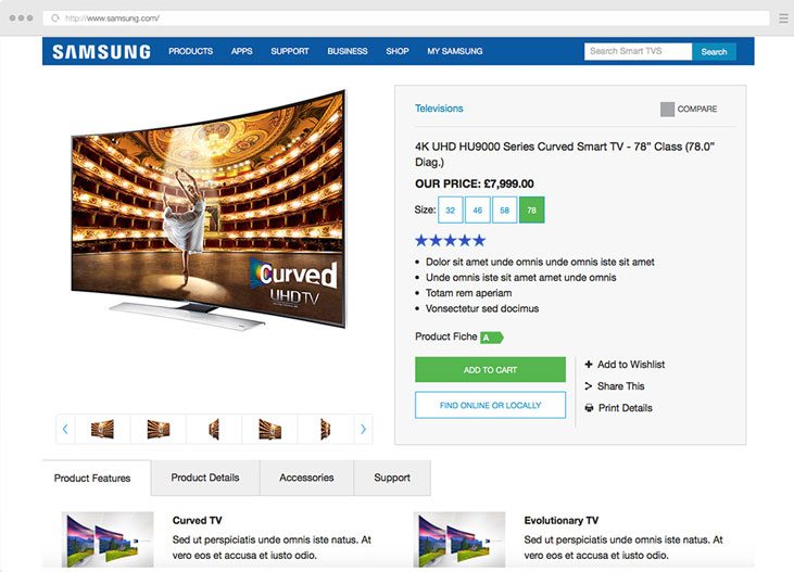
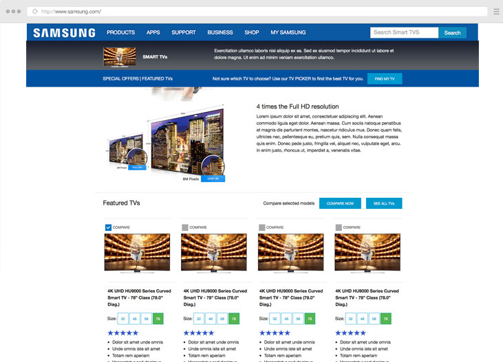
Once we moved into desktop view we increased the fidelity to better mimic the real world using style guidelines and imagery from the current website.
By doing so it allowed us to experience the prototype in greater detail and created a better framework for the design team to work with moving forward.
This later allowed us to find other uses for the "sticky" header. We found that pattern to be great for identify what feature a user might be reviewing on the features page, what products were being compared, what items have recently been added to the cart, ...etc.
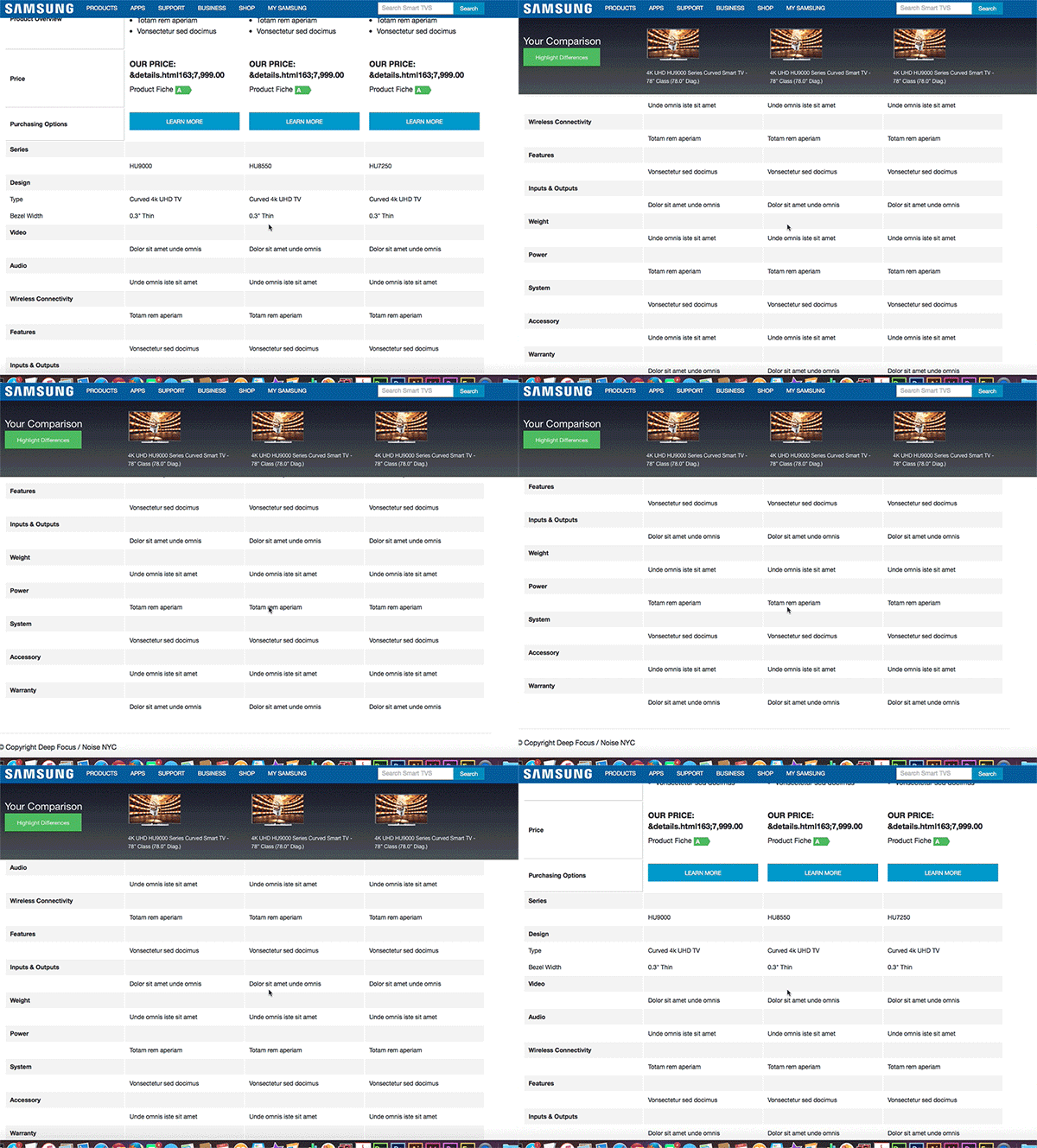
If you would like to review an early version of the prototype you may do so here (*Please note due to NDA agreements this is not the complete product).