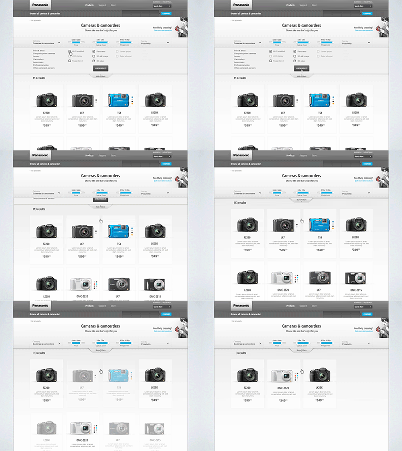
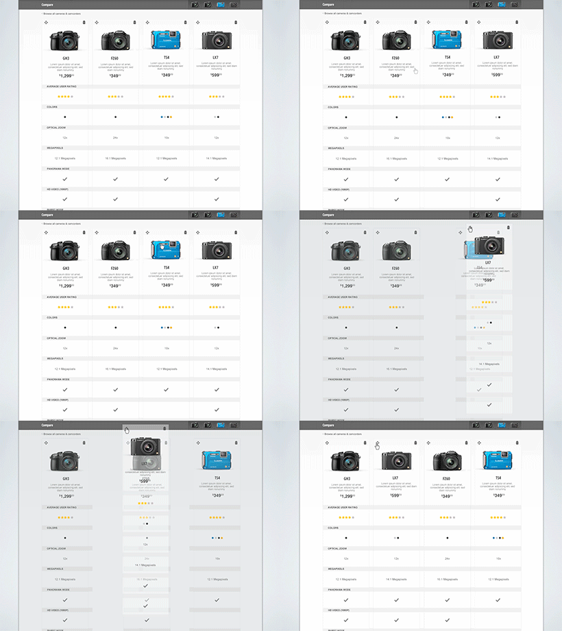
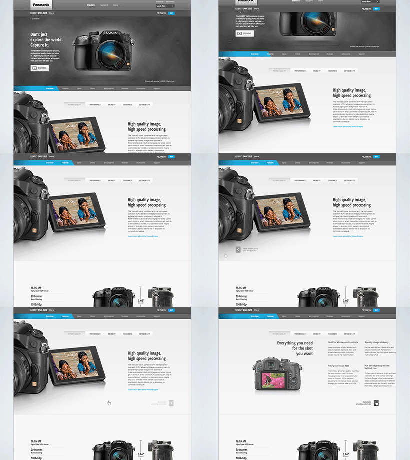
Learn,shop, and compare.
The Challenge
Panasonic was looking for a fresh approach to their consumer commerce sections of the company’s website. The product catalog ranges from televisions, audio and video gear, cameras, home office, personal care items and more. Globally they were aware that the website was being used more for information pertaining to learning of features and specifications where actual purchase activity happened more likely from other retailer outfits. Cart to sale increase was still an important factor of the platform but was lower on the priority list. On top of that list was better product grouping and hierarchy, clear navigational paths and UI, meaningful interactions, and a better product compare mechanism.
The solve

To begin we evaluated the current offering working to identify it’s strengths and weaknesses. We conducted stakeholder interviews, customer usability testing, and reviewed analytics. We also ranked their process against known practices, standard solutions, and current pattern models. Like most large product catalogs it was equally important to recognize that shopping behaviors vary based on product type and audience. For this we built out mental models and persona groups.
Some product types fall into multiple categories so we used sorting methods against the catalog to best determine where these product types overlap. From there we identified the base taxonomy to work with.
For the purpose of organization we used the camera category as the start model since we have identified that this category contains the bulk of content. The client also agreed the complexity of decision making in this category often derailed a sale. Comparison between models was an essential mechanism but there also was other things to consider about the deciding factor and user types.
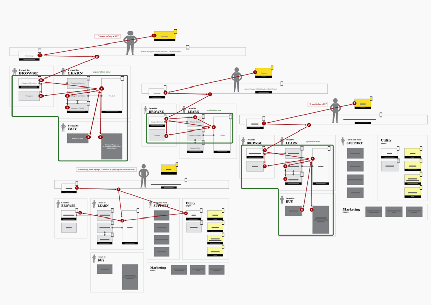
For instance, the user flow varies for those who came to:
- Learn
- Browse
- Get Support
- Ready To Purchase
What would be the best approach for professional consumers looking for a high end DSR verses a hobbiest looking for a mid range point and shoot and so on? To answer that it was determined that the flow entry point and continued path will vary considering these factors but the experience between each should be cohesive regardless. Who is to say that the hobbiest might not return again as the new professional?
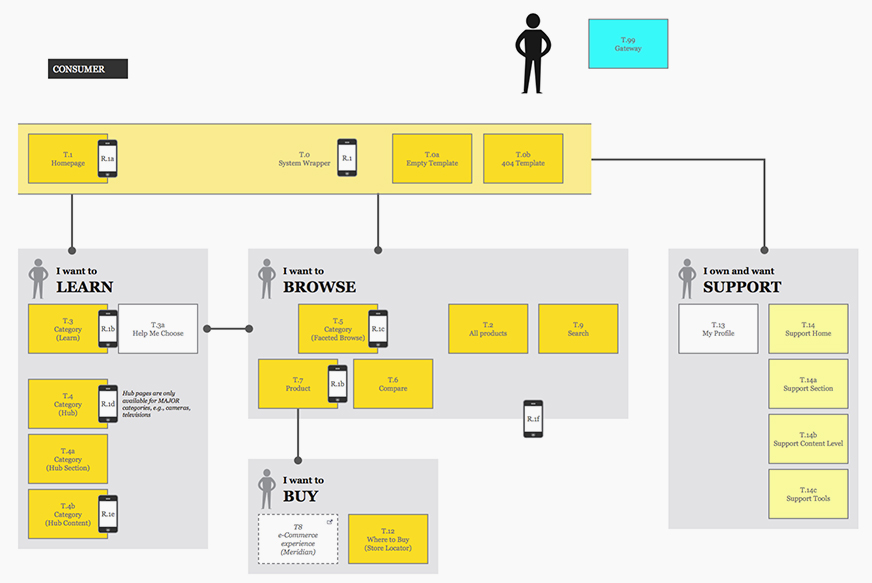
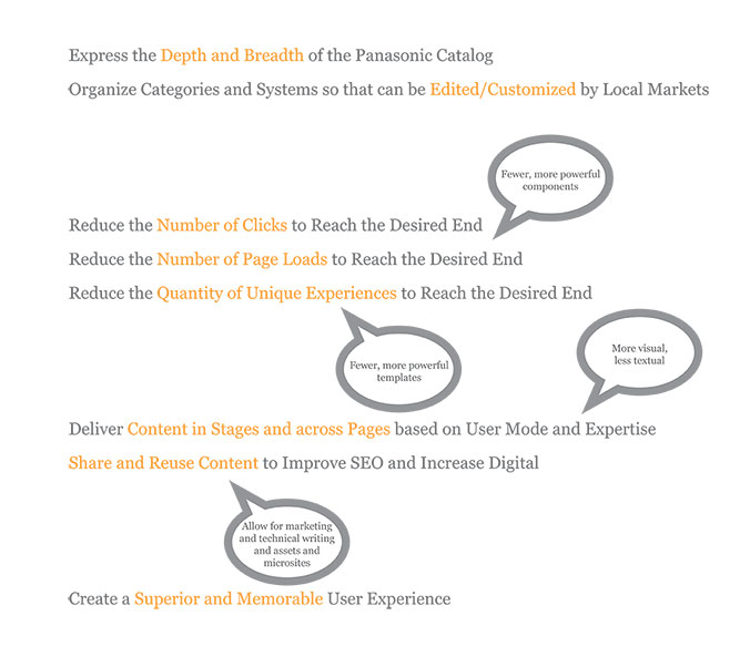
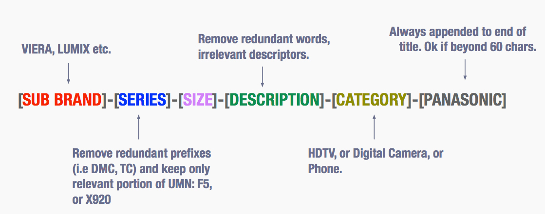
For the taxonomy a set of guidelines were offered for the product pages and category browse. Since new products are added constantly and old are removed it was essential that a structure was in place to adhere to. There was great focus on the SEO benefits as well.
Once the taxonomy and sitemaps were created we then took each of our personas and persona groups through each of the assumed flows and compared the experiences. Along the way we focused on the clearest path of intention and what else might be done to enhance the experience and encourage consideration.
During the wireframing stage we approached each with consideration of all interaction models as well as the content hierarchy and layout. We then explored which contained high value, which were just nice to haves, and which had no real true value.
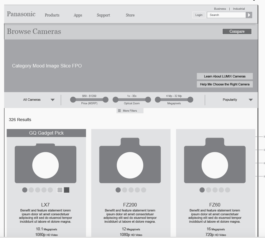
It was important to ensure the intent of each interaction model and to demonstrate how each model successfully enhances the experience and eliminates pain points.

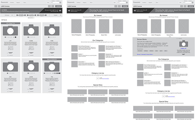
Mobile presentation was not a client ask at the time due to complexities of the backend platform. It would however be a future initiative.
Considering the complexities of some interaction models it was imperative for us to go into this thinking mobile first so the translation later on would be as smooth as possible.
Every layout and interaction was tested in the mobile space.
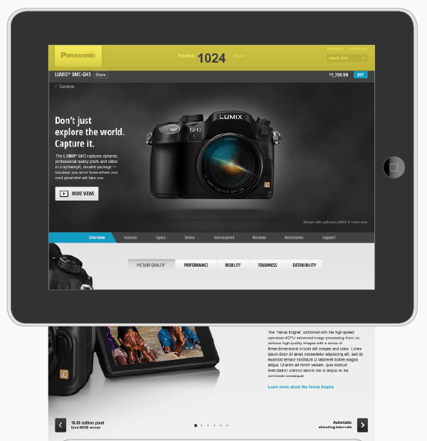
Prototyping
We began the prototyping in low-fidelity internally to review and test with our team. Later we increased the fidelity for client preview to better represent a closer to finshed product and to test with users in a real world scenerio.
You can see a overview video of the interactions here.
